corporate identity
Corporate Identity
CI
The typeface is a Gothic-style font that symbolizes the robustness of Korea Zinc's existing smelting business and the competitiveness of its new growth businesses. It uses regular modules that represent 'precision' and 'technical' aspects, evoking the trust associated with global companies. Notably, the corners of the typeface are inspired by the '괴' (ingot) motif.
and digital productions.
internal/external signage (signs, banners)
where visibility is crucial.
: blue, green, and orange.
-
KZ blue
#1271BB
-
KZ green
#1E973A
-
KZ orange
#E28207
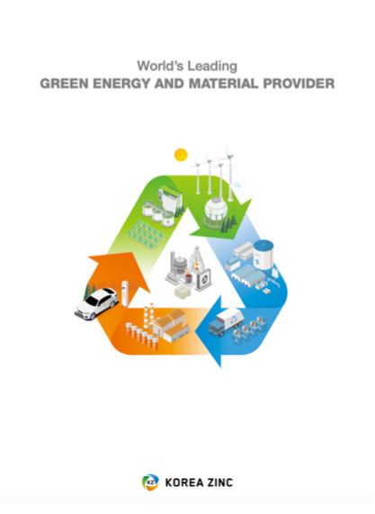
Company Brochure
You can see the present of Korea Zinc through the brochure.
1974 ~
GLOBAL STANDARD
KOREA ZINC
Korea Zinc has grown into a global company with an unwavering management philosophy since its foundation.
For 50 years, the company has remained a steady force in the industry, and now, it’s poised to leap forward as a top-tier company. Specializing solely in non-ferrous metals from the very beginning, Korea Zinc has become a global leader driven by creative passion and bold challenges. Moving forward, the company will continue to evolve into a top-notch company by developing eco-friendly technologies that surpass global standards.
Download company profile